Key Takeaways
- Colour psychology plays a decisive role in how family portraits feel — the right palette creates warmth, connection and timeless appeal, while a clashing one pulls the eye away from what matters most: your people.
- The perfect family photography colour scheme depends on three factors working together: the season, your shooting location, and the skin tones of everyone in frame.
- Neutral palettes anchor most professional shoots, but seasonal and jewel-tone combinations can add stunning depth when applied with intention — coordination beats matching every time.
Why Colour Psychology Is the Real Secret Behind Stunning Family Portraits
Most families focus on outfits, location, and timing. Colour psychology rarely enters the conversation — and yet it shapes how a viewer responds to your photos within seconds of glancing at them. Research consistently shows that colour accounts for 62–90% of a person's initial response to a visual. That means before anyone registers your children's expressions or the softness of the light, they've already formed an emotional impression based purely on your palette. This isn't abstract theory. It translates directly into whether your family portraits feel warm and inviting or disconnected and loud.The Emotional Weight of Warm and Cool Tones
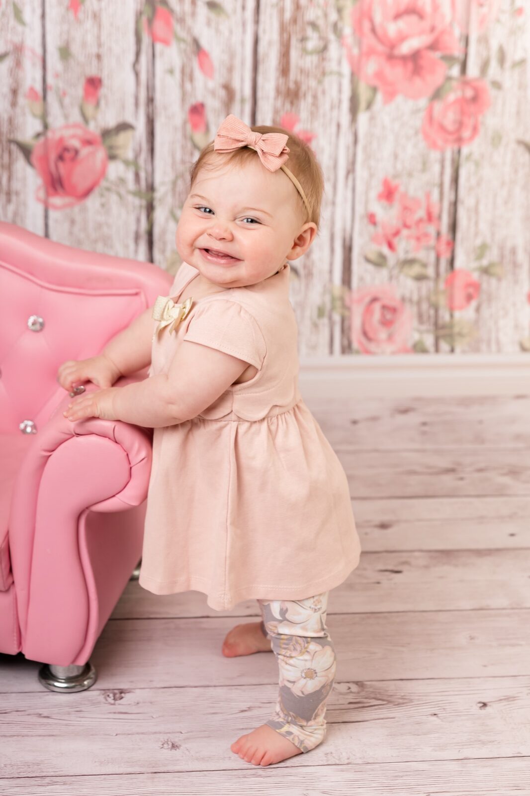
Warm hues — think coral, peach, soft mustard, and terracotta — create a sense of closeness and energy. They draw the eye inward and make subjects appear more prominent in the frame. Families who wear warm tones together in their portraits tend to look engaged with one another, radiating a natural togetherness. Cool tones — blues, soft lavenders, sage greens — do the opposite in the best possible way. They recede slightly, lending the image a calm, airy quality that lets light and landscape breathe. Neither is inherently better; the right choice depends on your setting, season, and the mood you want to convey.How Skin Tone Interacts with Your Palette
Colour doesn't exist in isolation — it plays off the complexions in your group. Warm, golden skin tones tend to glow against earthy palettes: rust, burnt orange, cream, and deep forest green. Cooler complexions often sing alongside dusty blues, soft pinks, and greige neutrals. When in doubt, bring a selection of options to your pre-shoot consultation and hold fabrics up against your faces in natural light. Our team at Faithful Photography's Glen Alpine studio walks every family through this exact process before a shoot. ---Matching Your Colour Scheme to Your Shooting Location
Location and colour palette need to be in conversation with each other. One of the most common mistakes we see is families choosing a palette they love in isolation, only to arrive at their shoot and realise it clashes dramatically with the environment.Outdoor Natural Settings in the Macarthur Region
South-West Sydney's natural landscapes — from the rolling green hills around Camden, NSW to the sandstone bushland near Campbelltown — offer a rich, earthy backdrop. When shooting outdoors, your palette should complement the environment rather than compete with it. For lush green settings, try:- Warm whites and creams paired with soft terracotta or tan
- Deep burgundy with muted sage — a combination that grounds beautifully against foliage
- Dusty mauve paired with warm beige for a feminine, romantic feel
Urban and Studio Settings
In the studio or against an urban backdrop, you have much greater freedom. Without competing natural colours, rich jewel tones thrive. Deep sapphire, emerald, and forest green look striking against clean, neutral studio backdrops. Bold contrast — for instance, navy and ivory — reads with a crisp confidence that outdoor greenery would soften. At Faithful Photography, our studio spaces in Glen Alpine and Gledswood Hills are designed to work beautifully with a wide range of palettes. We can advise on which tones photograph best under our studio lighting before you commit to outfits. ---Seasonal Colour Palettes That Actually Work
There's a reason professional photographers lean into seasonal palettes — nature has already done the colour-coordination work for you. When your outfits echo the tones of the environment, the result feels intentional and visually harmonious.Spring and Summer Palettes
Sydney's spring arrives with soft blooms and golden light. This is the season for gentle, airy palettes that mirror the freshness of the environment.- Spring: Dusty rose, sage green, and warm cream work beautifully together. They nod to the season's softness without overpowering it. Avoid stark white — it bounces harsh light and can wash out complexions. Opt for off-white or ivory instead.
- Summer: Navy, coral, and white is a classic combination that holds its own against bright light and open skies. The contrast between deep navy and lively coral adds visual depth, while white balances the composition.
Autumn and Winter Palettes
Autumn in South-West Sydney brings a warmth to the light and earthy tones to the landscape — particularly around Camden's rural fringes and the parks of the Macarthur region.- Autumn: Burgundy, mustard yellow, and deep forest green echo fallen leaves and golden hour beautifully. These rich, saturated tones photograph with incredible warmth and dimension.
- Winter: Emerald green, cranberry red, and cream create a festive energy that stops short of looking like a Christmas card. These tones feel intimate and intentional — perfect for end-of-year portraits that don't scream "holiday themed."
"The families who walk away with their absolute favourite portraits aren't the ones who matched — they're the ones who coordinated with intention. Colour tells your story before a single expression is even seen."---
The Timeless Case for Neutral Colour Palettes
If you're ever in doubt, neutrals are your safest and most elegant choice. Cream, taupe, warm white, soft grey, and camel have dominated professional family photography for decades — not because photographers lack imagination, but because neutrals genuinely work everywhere, in every season, and for every skin tone.Why Neutrals Never Date
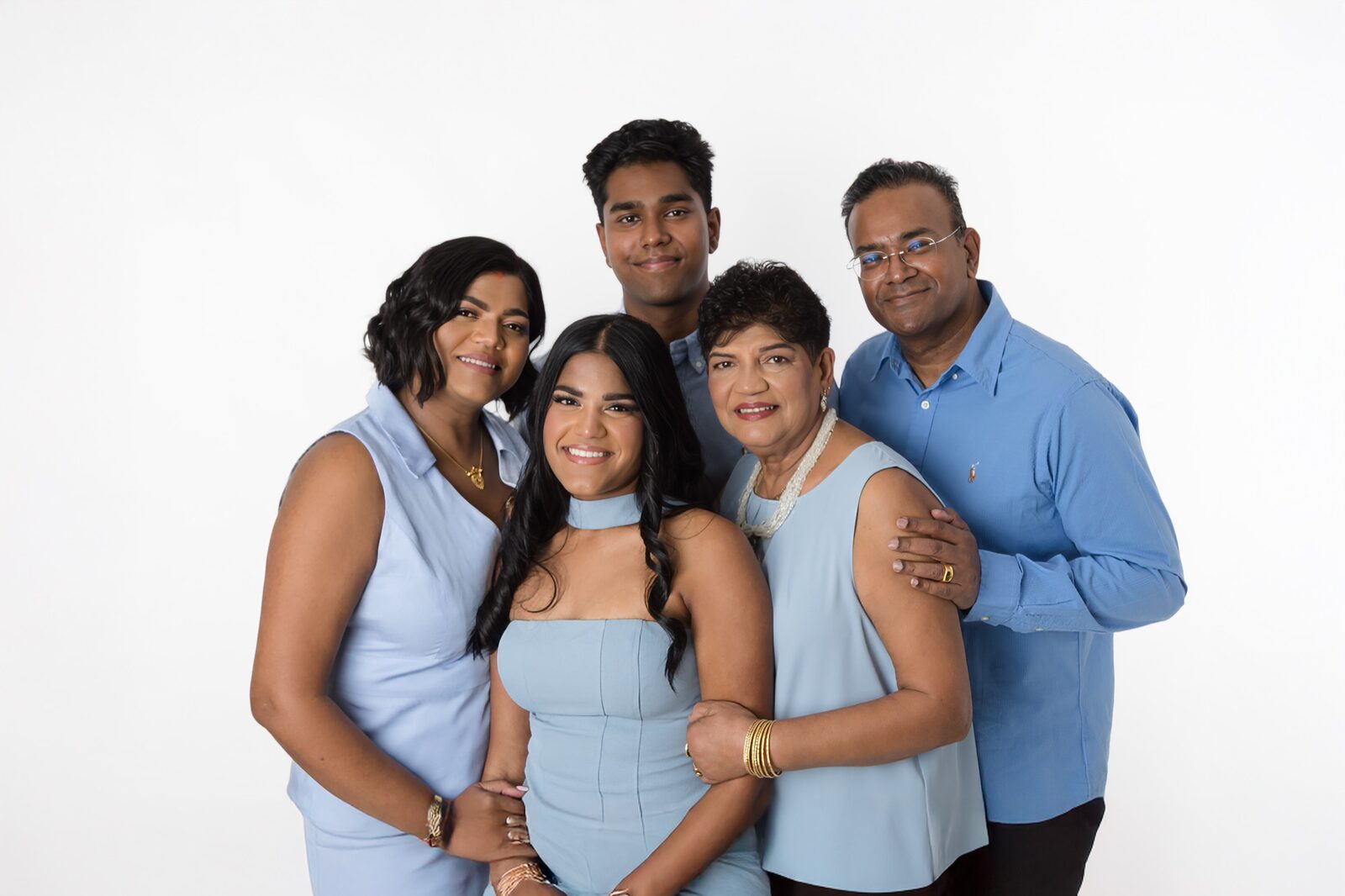
Trend-driven colours date quickly. The teal-and-orange combination that looked fresh in 2018 already feels of its era. Neutrals, on the other hand, are timeless by nature. When you look back at portraits in ten or twenty years, a soft ivory-and-taupe palette reads as classic rather than dated. The rule of thumb: keep your neutral group to no more than three tones. For example:- Choose a base tone — cream, warm white, or ivory
- Add a mid-tone — soft tan, camel, or warm grey
- Introduce a texture accent — a textured oatmeal knit, a linen navy piece, or a warm blush layer
Ready to Plan Your Perfect Family Session?
Our team helps South-West Sydney families choose colour schemes, outfits and locations that produce portraits you'll love for a lifetime. Let's make it happen.
Bold and Modern Colour Schemes for Contemporary Families
Not every family wants a classic, understated palette — and there's absolutely a place for bold, modern colour choices in professional family photography. The key is knowing how to deploy statement colours without letting them overwhelm the image.Jewel Tones Done Right
Jewel tones — deep emerald, rich sapphire, amethyst, and burnished gold — are having an enduring moment in portrait photography, and for good reason. They photograph with incredible richness, especially in studio environments and at golden hour. The golden rule: let one person carry the bold tone. Style that family member — often Mum, or the most confident dresser in the group — in the statement colour, then dress everyone else in complementary neutrals. A deep sapphire dress paired with cream and warm grey across the rest of the family creates a composition with a natural focal point rather than visual competition.Instagram-Ready Combos for Modern Families
Some combinations are proving particularly popular for contemporary family portraits in South-West Sydney right now:- Emerald green and blush pink — rich and romantic, particularly beautiful for spring outdoor sessions
- Royal blue and warm gold — bold, confident, and striking in studio settings
- Dusty lilac and warm camel — unexpected, soft, and surprisingly versatile across skin tones
Coordinating Outfits Without Making Everyone Match
Here's a distinction that makes an enormous difference: coordinating is not the same as matching. Matching means everyone wears the same colour. Coordinating means everyone's colours belong to the same family, tone, or palette — but with enough variation to keep the image visually interesting.The Anchor Piece Method
Start with one statement piece — usually Mum's outfit, since it tends to have the most colour. From there, build the rest of the family's looks around the tones in that anchor piece. If her dress has dusty mauve, warm cream, and sage accents, those become your palette. Style Dad in warm cream linen, the kids in sage and dusty rose, and the visual language stays coherent without anyone looking identical.Textures and Layers Add Visual Depth
Where colour is restrained, texture does the heavy lifting. A family all in warm neutrals gains enormous visual interest through a knitted cardigan, a linen blouse, a denim layer, or a textured skirt. Texture variation is what prevents a neutral palette from looking flat or boring in print. For inspiration beyond colour, check our guide to coordinated family portrait styles for every season. ---Common Colour Mistakes That Flatten a Family Portrait
After photographing hundreds of families across the Macarthur region, we've seen the same missteps come up repeatedly. Avoid these, and you're already ahead of most families:- Stark white clothing — it bounces harsh light, blows out in direct sun, and often creates an unflattering pallor. Always swap to off-white, ivory, or cream.
- Too many competing bold colours — when everyone wears a different statement tone, the eye doesn't know where to land. The image feels chaotic rather than connected.
- Ignoring the background — choosing your outfits before you've confirmed your location is working in reverse. Lock in the location first, then build your palette around it.
- Highly branded or logoed clothing — prints and logos pull the eye immediately and date quickly. Solid tones or subtle textures always photograph better.
- Forgetting shoes and accessories — a beautifully coordinated family group can be undone by mismatched, brightly coloured footwear that wasn't considered as part of the palette.
Frequently Asked Questions
How do I choose the perfect family photography colour scheme if we have very different skin tones in our group?
Mixed skin tone groups actually have the most flexibility. Warm neutrals — cream, camel, warm taupe — are universally flattering across a wide range of complexions. Earthy palettes like terracotta, burnt orange, and warm white also tend to work beautifully. Avoid cool-heavy palettes (all grey, all pale blue) if you have deeply warm or dark skin tones in the group, as these can feel disconnected. Bring fabric swatches to your pre-shoot consultation and hold them up to everyone's faces in natural light for a practical test.
Should we avoid patterns and prints entirely for a family photoshoot?
Not necessarily — but patterns require careful handling. One patterned piece per group is generally the maximum. The pattern on that piece should contain tones that anchor the rest of the family's solid palette. For example, a floral dress in dusty rose, sage, and cream means the rest of the family can wear solid sage, cream, or warm white. If multiple people wear patterns, the image quickly becomes visually overwhelming. Fine stripes and small-scale textures are generally safe; large graphic prints and logos are best avoided.
What colour schemes work best for outdoor family sessions in South-West Sydney?
South-West Sydney's outdoor locations — the bushland reserves around Campbelltown, the rural paddocks near Camden, and the parks of Gledswood Hills and Glen Alpine — are rich in green, golden, and earthy tones. Palettes that echo these natural tones photograph most harmoniously: warm whites, earthy tans, burgundy, mustard, and deep forest green all integrate beautifully. Bold blues and bright corals can work, but they'll stand out rather than blend, which requires a deliberate compositional approach to avoid looking disconnected from the landscape.
Is it better to match or coordinate for a family photoshoot?
Coordinate, always. Matching — everyone in the same colour — tends to look rigid and dated quickly. Coordinating means everyone's outfits share the same colour family or tonal range, but with enough variation in shade, texture, and layering to keep the image visually dynamic. The goal is for the group to look like they belong together, not like they're wearing a uniform. A well-coordinated family in three or four tonal variations will always look more natural and engaging than a perfectly matched group.
How many colours should our family wear in total for a photoshoot?
As a general rule, stick to a palette of two to four tones across the entire group. A base neutral (cream, ivory, warm white), a mid-tone (camel, sage, soft grey), and one optional accent colour is a reliable formula that photographs beautifully at any time of year. Adding more tones beyond four risks the image feeling visually cluttered. Texture — through knitwear, linen, denim, or layering — is how you add interest within a restrained palette, rather than introducing additional colours.
Can Faithful Photography help us choose our colour scheme before the shoot?
Absolutely — and we strongly encourage it. Every booking at Faithful Photography includes a pre-shoot consultation where we discuss your colour palette, location, and the overall feel you're aiming for. We'll look at your outfit options together, consider the backdrop and lighting conditions, and make sure everything is working in harmony before the day of your shoot. It's one of the most valuable parts of the process and ensures you arrive feeling confident rather than second-guessing your choices in the car park.
Visit Faithful Photography Today
We're South-West Sydney's trusted family portrait studio, with locations in Glen Alpine and Gledswood Hills and a team that genuinely loves helping Macarthur families create portraits they'll pass down through generations. Reach out today and let's start planning a session that's perfectly suited to your family, your colours, and your story.