Key Takeaways
- Consistent spacing and a deliberate layout are the difference between a wall that looks curated and one that looks cluttered — plan on paper before you pick up a hammer.
- Whether you choose matching frames or an eclectic mix, a unifying colour story is what keeps your family photo wall looking intentional rather than accidental.
- High-quality source photos make every display style work harder — professional portraits give you the tones, sharpness and emotional depth that truly shine at scale on a wall.
Why Your Family Photos Deserve a Proper Wall Display
There's a particular kind of guilt that lives in a hard drive. You know the photos are there. You just never quite get around to printing them. Research consistently shows that children who grow up surrounded by family portraits on the walls have a stronger sense of identity and belonging. That's not marketing copy — that's developmental psychology. A wall of family photos is a quiet, daily message to your kids: you belong here, your story matters. Beyond the emotional argument, there's the purely aesthetic one. A thoughtfully arranged family photo wall is one of the most cost-effective ways to transform a room. No artwork carries quite the same weight as images of the people who actually live there.The Problem with "I'll Sort It Later"
"Later" is where beautiful photos go to disappear. We see it constantly — families who did a family photoshoot in Sydney two or three years ago, who loved every image, and whose prints are still rolled in a tube behind the wardrobe door. Don't let that be your story. ---How to Space and Arrange Your Family Photos
The difference between a wall that looks curated and one that looks like someone threw memories at a dartboard is simple: spacing and structure. Families repeat the same mistake. They eyeball the wall, hammer a nail, step back, shrug. The result is gaps that read accidental rather than deliberate — and a layout that quietly bothers them every time they walk past it. Do yourself a favour: plan on paper (or use a free app like Canva or Magicplan) before anything touches paint.The Golden Rule: Consistent Gaps
Professionals keep spacing consistent — 5 to 7 centimetres between frames is your sweet spot in most Australian home settings. This gives the eye a beat, a rhythm. Too tight and the wall feels crowded. Too wide and the pieces don't read as a cohesive collection.- Measure your wall width and height before buying frames.
- Cut paper templates to the exact frame sizes and use painter's tape to mock the layout on the wall first.
- Stand back from at least three metres to assess balance — what looks even up close can skew dramatically from across the room.
- Keep the visual centre of your arrangement at roughly eye level, typically 145–155 cm from the floor.
Grid Layouts: Clean, Modern and Easy to Nail
A grid layout works beautifully when frames are uniform in size and evenly spaced. Think clean lines, a modern aesthetic, and the kind of symmetry that reads intentional even at a glance. Stick to standard sizes — 20×25 cm, 28×35 cm or 40×50 cm — and the maths becomes almost boring: divide the wall width by the number of frames, subtract the frame widths, then divide the leftover space evenly across the gaps. The result is symmetry that doesn't require an interior designer. ---The Masonry Approach: Polished Asymmetry That Works
If a rigid grid feels too formal for your home, the masonry layout offers structured variety. Frames share a consistent width but vary in height — staggered like brickwork. It looks relaxed and polished at once, which is a genuinely difficult combination to pull off. Why it works: the consistent frame width anchors the eye, so your brain can enjoy the variety without getting disoriented. The repeated width prevents visual noise; the changing heights add personality. Balance, not randomness, is the secret. This style works particularly well in open-plan living areas — a format common in newer builds across Gregory Hills, Oran Park and Gledswood Hills, NSW. It suits both timber-toned and white-wall interiors."A great family photo wall doesn't just fill empty space — it tells a story. Every gap between frames is a breath, and every portrait is a chapter your kids will read for years."---
Matching Frames vs. Eclectic Walls: Which Is Right for You?
This is the question that stalls most people for months. Here's the honest answer: both work — but they require different disciplines.The Case for Matching Frames
Matching frames are your easiest path to a refined look, especially when you're combining black-and-white portraits with colour shots. Uniform frames remove visual competition; the photographs become the headline. If you want a streamlined, modern result with fewer decisions at 9 pm on a weeknight, match your frames and let the images do the heavy lifting. Matte black, natural timber and brushed white are the three frame finishes that translate most reliably across different interior styles.The Discipline of Eclectic Design
Eclectic is not code for chaotic. Mixed frames demand more discipline than matching ones — not less. The rules:- Keep finishes consistent (all black, all brass, or all white) even if sizes and styles vary.
- Keep frame widths similar — don't mix wafer-thin mouldings with chunky chunky profiles.
- Anchor the collection with a colour story pulled from the photographs themselves.
- Leave breathing room — don't tile every centimetre of wall. Negative space reads as confidence.
Choosing the Right Photos for Your Wall
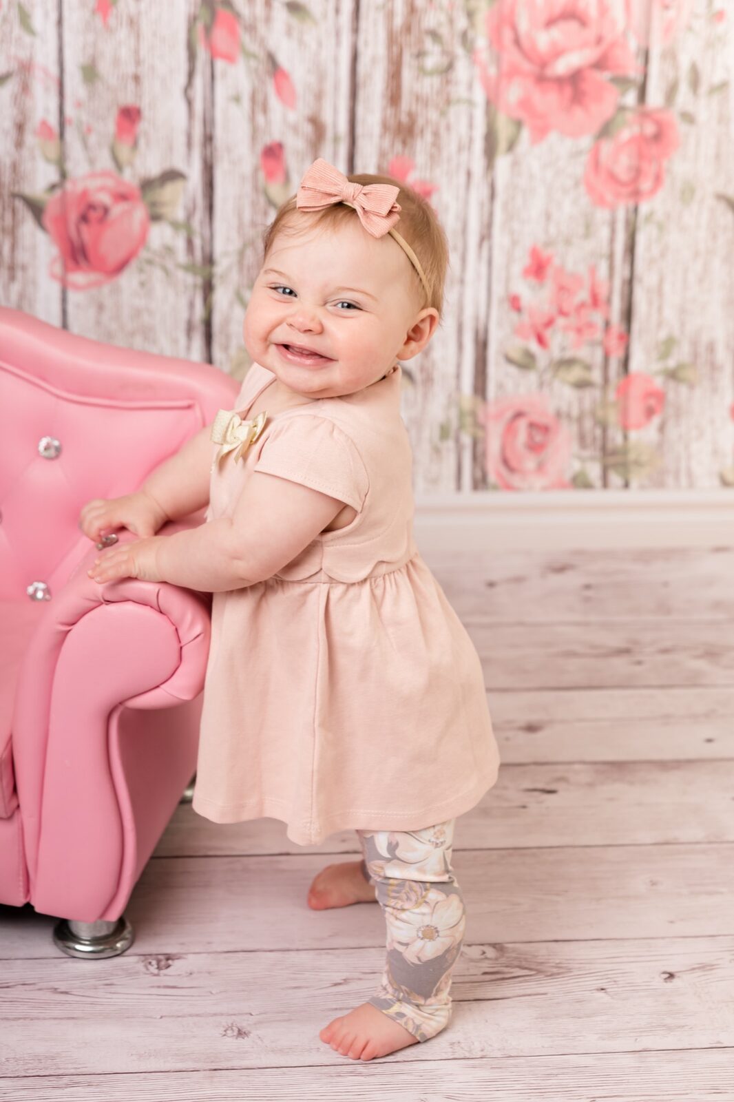
Not every photo belongs on a wall — and knowing the difference is what separates a gallery wall from a scrapbook explosion. Wall-worthy images share a few qualities: strong composition, good tonal range, and emotional resonance that holds up at scale. A photo that charms you on a phone screen can fall completely flat when printed at 40×50 cm. Conversely, a beautifully lit professional portrait only gets better as it grows.Why Professional Portraits Print Better
Smartphone cameras have improved enormously, but they still fall short in three areas that matter enormously for large prints: dynamic range, depth of field control, and low-light clarity. A professionally lit portrait — captured with full-frame camera equipment in a controlled studio environment — gives you files that hold stunning detail at statement print sizes. This is why our Gledswood Hills photography clients often tell us their wall prints look better than the digital files — because the print medium rewards that level of technical quality in ways a screen simply can't match. Before your session, think about your family's wardrobe choices. Cohesive, coordinated outfits — not matching, but complementary — give your wall display a unified colour palette that's immediately easier to frame and style.How Many Images Do You Actually Need?
For a gallery wall of 9–12 frames, you'll typically want 4–6 anchor images (the hero shots you centre the display around) and 5–8 supporting images that complement them. For an extended family session, you'll likely come away with enough variety to mix individual, couple and full-group shots across your display — which adds genuine depth to the narrative. ---From Planning to Installation: Getting the Hardware Right
The most beautiful layout becomes a frustration if the installation is wrong. Crooked frames, popped anchors and drywall damage are avoidable — but only if you use the right hardware from the start.- Find your studs. A stud finder costs less than twenty dollars and will save you from failed drywall anchors. Whenever possible, drive screws into studs — especially for heavier frames and shelves.
- Use a spirit level. Not your eye. A level. Even a slight tilt reads as careless once you've stared at it for a week.
- Use rated anchors for the load. Standard plastic plugs fail under repeated stress. Use metal toggle bolts or rated hollow-wall anchors for anything over 5 kg.
- Create a paper template. Trace each frame onto butcher's paper, cut it out and blu-tack the templates to your wall. Live with it for a day before you commit.
- Hang the largest piece first. Build the layout outward from your anchor image — don't work from one corner to the other.
Floating Shelves and Picture Ledges
Picture ledges offer something standard hanging hardware can't: flexibility. Swap prints seasonally, rearrange without new nail holes, and layer frames front-to-back for depth. They're ideal if you anticipate your collection growing over time — a new newborn, a cake smash milestone, a family reunion shot from your next extended family session. Mount ledges into studs where possible. Use a spirit level, not your eye — even 2 mm of tilt becomes obvious once frames sit on the shelf.Rail Systems for Heavier Prints
A picture rail system mounted to studs can support 25 kg or more — ideal for large canvas prints or metal prints that wall hooks simply aren't rated to handle. Install the rail level first (a laser level earns its cost here), then use adjustable wire or rod hangers to position frames precisely. The added benefit: adjusting height requires moving the hook, not pulling a nail. ---Ready to Create Your Wall Display?
The right wall starts with the right photos. Our studios in Glen Alpine and Gledswood Hills are ready to create portraits that look stunning at any print size — from intimate 20×25 cm frames to statement 60×90 cm canvases.
Display Styles Worth Trying in 2025
Beyond the classic grid and gallery wall, a few creative display approaches are having a strong moment in Australian homes right now.The Single Statement Canvas
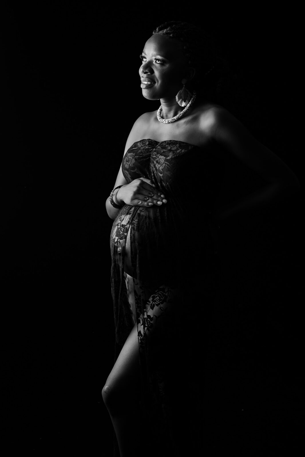
One large-format canvas — 60×90 cm or bigger — anchored on a feature wall is quietly the most impactful thing you can do with a portrait. No arrangement anxiety, no spacing calculations. Just one extraordinary image given the space it deserves. It works particularly well with a single editorial family portrait or a maternity portrait where the negative space in the composition carries the design.The Staircase Ascent
Staircase walls are made for family photo displays. Follow the rake of the stairs with your arrangement — keep the visual centre of each frame parallel to the staircase angle for a cohesive flow. Mix portrait orientations to break any rigidity. This is one of the most visited spots in any home, which makes it a quietly powerful choice.The Bedroom Triptych
Three coordinated portraits hung horizontally above a bedhead — same frame, same print finish, different images — creates a hotel-suite-level effect that's genuinely achievable in a suburban South-West Sydney home. Works best with consistent background tones across the three images, which is one strong argument for having all three shot in the same session. ---Frequently Asked Questions
What is the best way to display wall family photos in a small room?
In a small room, scale down your frames but don't abandon the idea of a display wall entirely. A tight three-image arrangement with uniform frames works beautifully in a hallway or small dining room. Keep spacing tighter — around 4 cm — and choose a single wall rather than spreading across multiple surfaces, which can make a small room feel busier. Vertical arrangements also work well in narrow spaces like hallways.
How do I choose between canvas prints and framed prints for a family photo wall?
Canvases work exceptionally well as single statement pieces or in a triptych arrangement — they have a painterly quality that suits large-format portraits and are often lighter than equivalent framed prints. Framed prints are more versatile for gallery walls because you can mix sizes, orientations and finishes more easily. For a mixed display, consider using one or two canvases as anchors and framed prints around them.
Can I use photos from my phone for wall prints, or do I need professional photographs?
Smartphone photos can work for smaller prints — up to about 20×25 cm — but they typically show compression artefacts, noise and limited dynamic range at larger sizes. For statement prints of 40×50 cm or bigger, professionally captured images with proper studio or natural lighting will look dramatically sharper, more vibrant and emotionally richer. The investment in a professional session pays dividends every single time you walk past the wall.
How many photos should be in a family photo wall arrangement?
There's no fixed number, but most well-balanced gallery walls contain between 7 and 15 pieces. Below 7, the arrangement can feel sparse unless you're working with large statement pieces. Above 15, it becomes very difficult to maintain cohesion without the whole thing reading as cluttered. Start with 9 — it's the most forgiving number for both symmetrical and asymmetrical arrangements — and expand from there as your collection grows.
Do I need to use a professional to hang a family photo wall?
Not necessarily, but proper preparation makes all the difference. Use paper templates and painter's tape to plan the arrangement on the wall before committing. A stud finder, spirit level and rated wall anchors cover the technical side. Where professional help genuinely earns its cost is on very large, heavy canvas prints or feature walls with expensive wallpaper — a single misaligned hole in those situations can be costly to repair.
Where in the Macarthur region can I get a family portrait session?
Faithful Photography operates studios in Glen Alpine and Gledswood Hills, and we regularly photograph families across Campbelltown, Camden, Narellan, Gregory Hills, Harrington Park, Mount Annan and surrounding suburbs. Our Campbelltown photographers and Camden photographers pages have more detail on how we serve the wider Macarthur region. You can check our session pricing or head straight to our booking page to lock in a date.
Visit Faithful Photography Today
Your family's story deserves to live on the wall — not locked in a hard drive. Our award-winning studios in Glen Alpine and Gledswood Hills are ready to create portraits you'll be proud to display, in South-West Sydney and across the Macarthur region.